
Overview
Problem
Renting sports equipment (like snowboard equipment) can be costly. People can buy their own equipment but many only use them sparingly.
Project Goal
Develop a peer-to-peer rental app where users can rent equipment, not limited to sports gear, from each other!
Tools
Adobe Xd
Adobe Photoshop
Adobe Illustrator
InVision App
Marvel App
User Interviews & Pain Points
I conducted six qualitative interviews to understand my potential users’ behaviors. I explained the app concept and asked questions about their hobbies, pain points, and what they would like to see in the app. Here are some key points:

Long Waits
People hate waiting in long lines to get their rental equipment.

Idle Equipment
Purchased equipment may often be used sparingly or not at all.

Limited Selection
Some items can’t be rented anywhere and must be purchased.

Rental Fees
Fees can be costly, sometimes up to 50% of the item itself.
User Personas
After analyzing my interview notes I created three personas that represented the three demographics of users.

Competitor Research
I identified the strengths and weaknesses of similar services. I borrowed influence from what made these apps work well and took note of what they were lacking (e.g. poor search filters).

Sketches & Testing
I constructed paper wireframes and imported the screens into the Marvel App for users to test and click through. Here are some comments from the 15 users who tested the prototype.

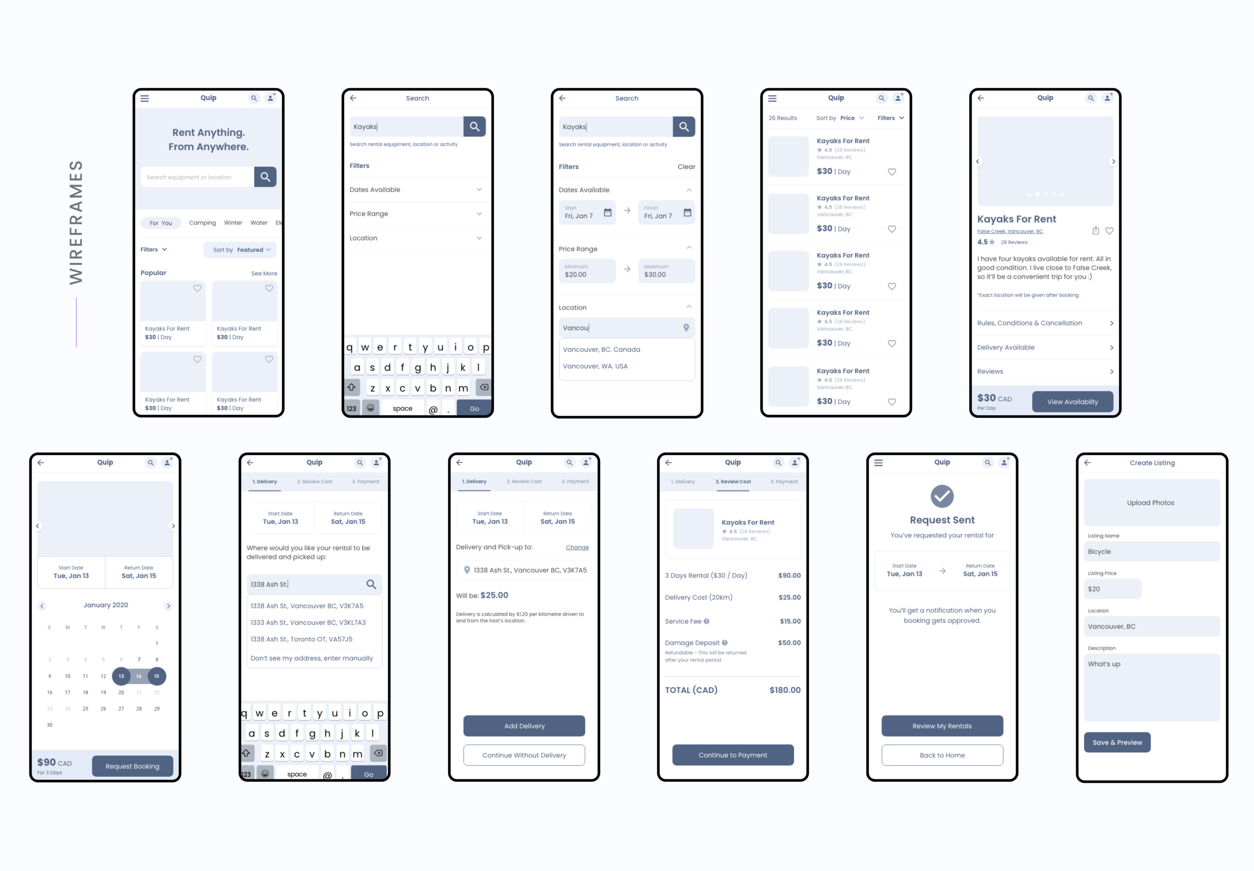
Wireframes
After getting feedback from my Marvel App prototype, I implemented the changes and created mid-fidelity wireframes on Adobe Xd. I reconfigured the layout, added features and designed desktop layouts as well.
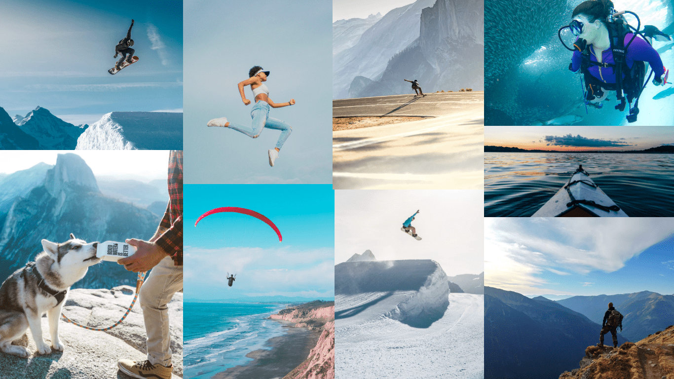
Moodboard
I wanted the UI to convey an adventurous mood and compiled a mood board of activities users might do with the equipment they rent through the app.
Style Guide
I chose teal as my primary colour because it’s a mix of blue and green. Blue signifies trust and reliability while green is often used in nature and environmental branding. I wanted to combine the two to convey the feelings these colours evoke.


Browse / Homepage
Quip’s homepage features a variety of rentals that can be viewed without creating an account. Once logged in, the grid is tailored to the user’s preferences and previous rentals.
Search Results Page
Search results can be viewed in a list or grid view (a requested feature from user testing). Mobile-only shows a list view to eliminating text-wrapping on long titles (eg. having two columns).
Product Rental Page
Users can view a rental’s availability without having to create or log into their account. Sign-in is only prompted when they continue booking dates.
Rental Flow
Step One
Delivery & Pickup
Once the user has booked dates, the app asks them if they would like delivery and pick-up for their rental.
Step Two
Delivery Address
Address lookup makes it both easier for the user to find their location and helps conversion rates compared to form fields.
Step Three
Checkout & Payment
At checkout, the user can review total cost details and edit any items such as dates and delivery. Payment details are saved for convenient future purchases.
Account Page
Users can access and edit their account using the profile icon on the top right. Users can access their saved rentals, rental postings as well as chat with other hosts and renters (useful for adjusting bookings etc.). Once logged in, the grid is tailored to the user’s preferences and previous rentals.
Afterthoughts
This was an extremely fun project to work on. In the future I’d love to be able to implement features like monthly rentals and embed a weather and holiday toggle for the booking calendar so users can book equipment on the perfect days.